Skincare that knows who it's for.
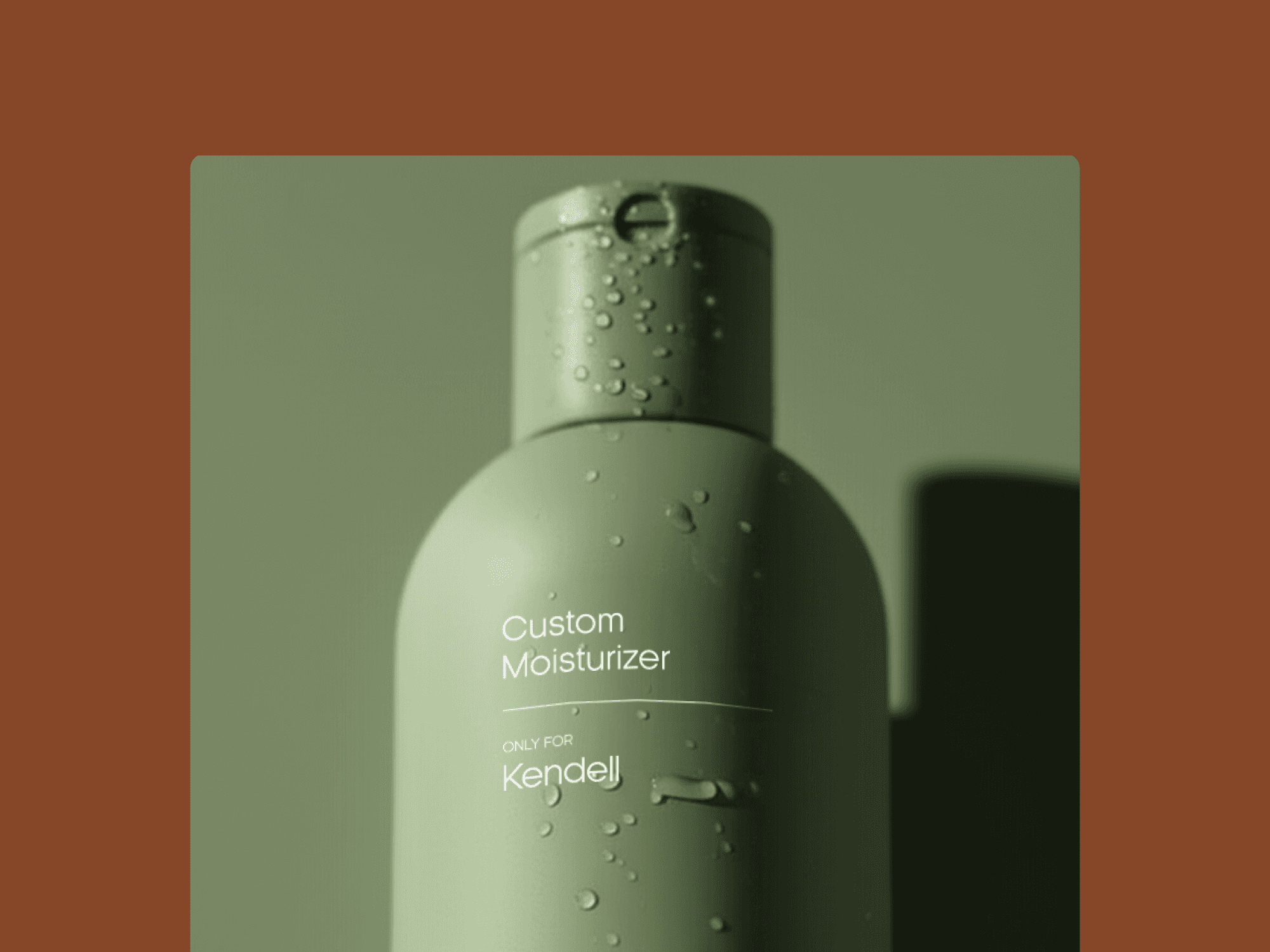
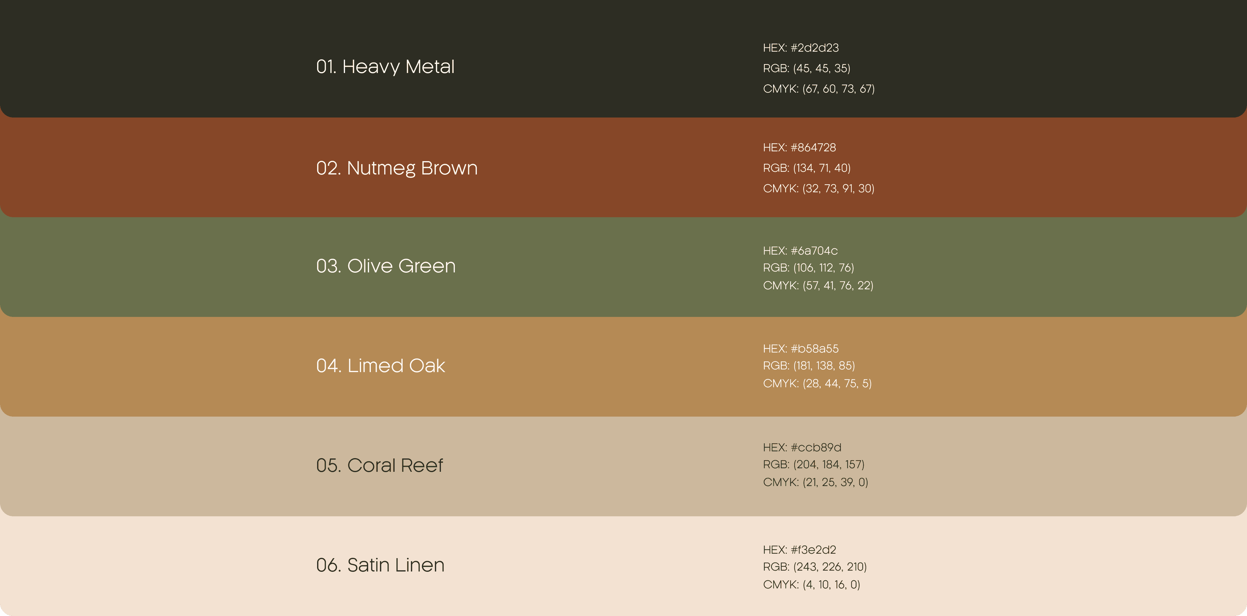
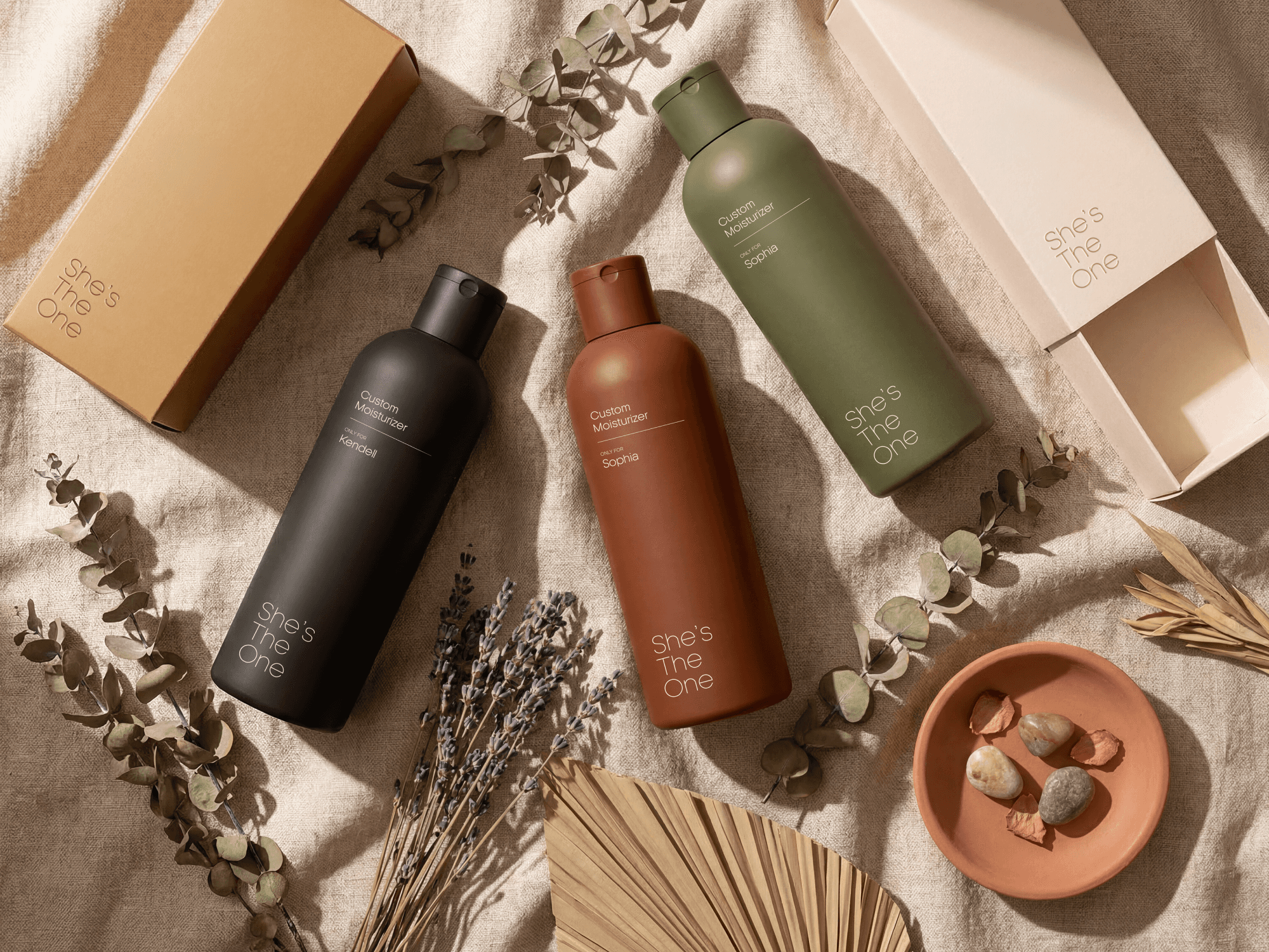
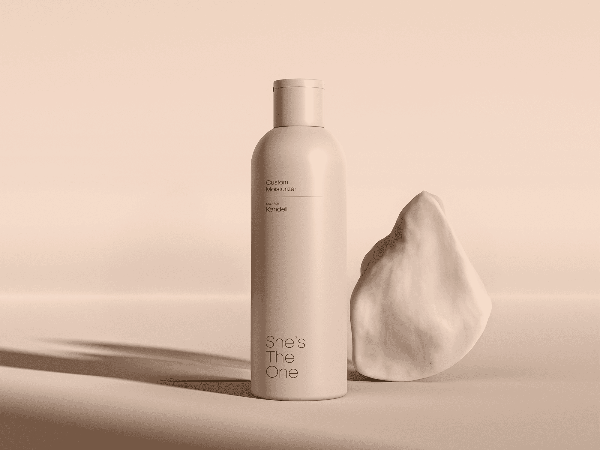
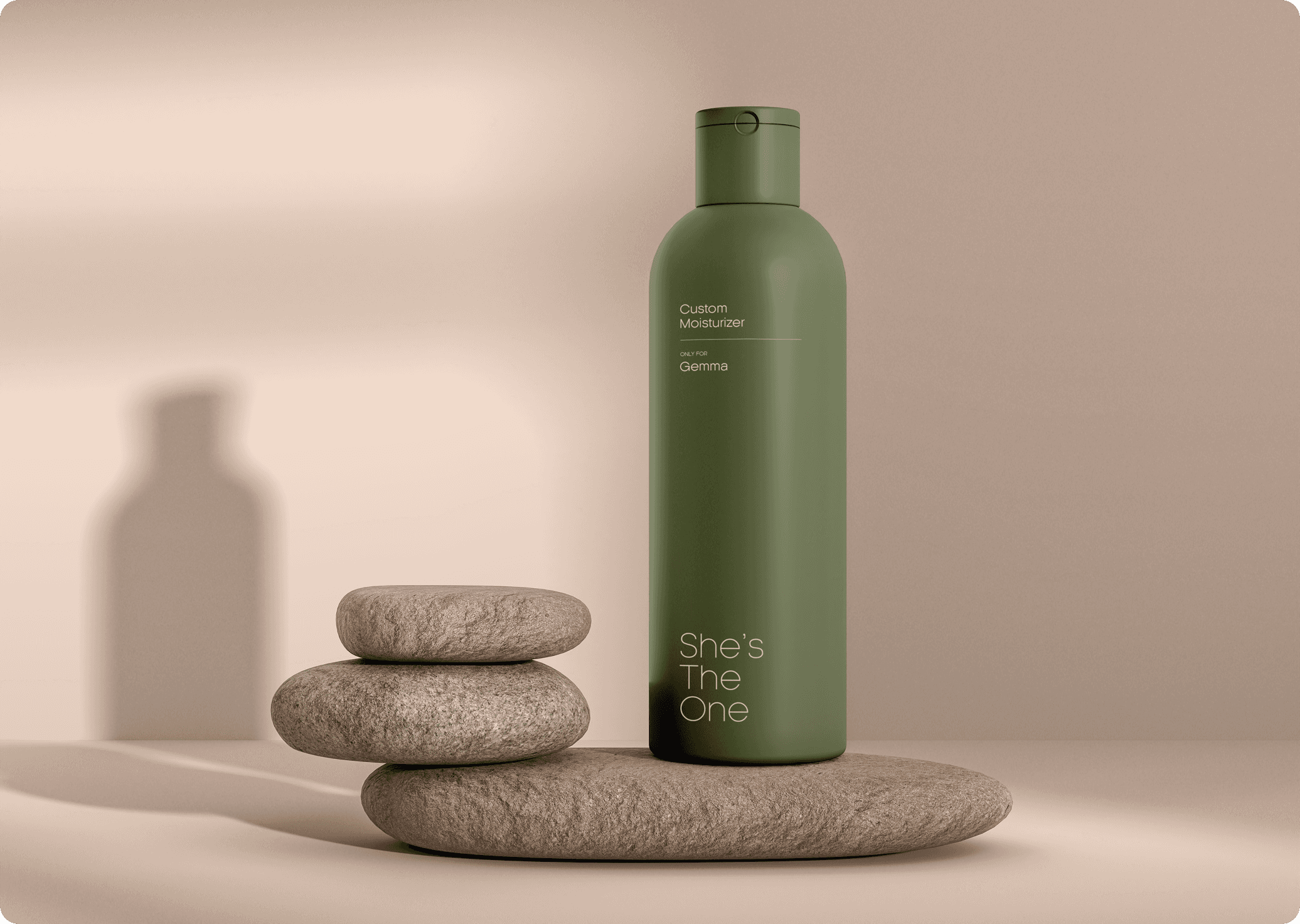
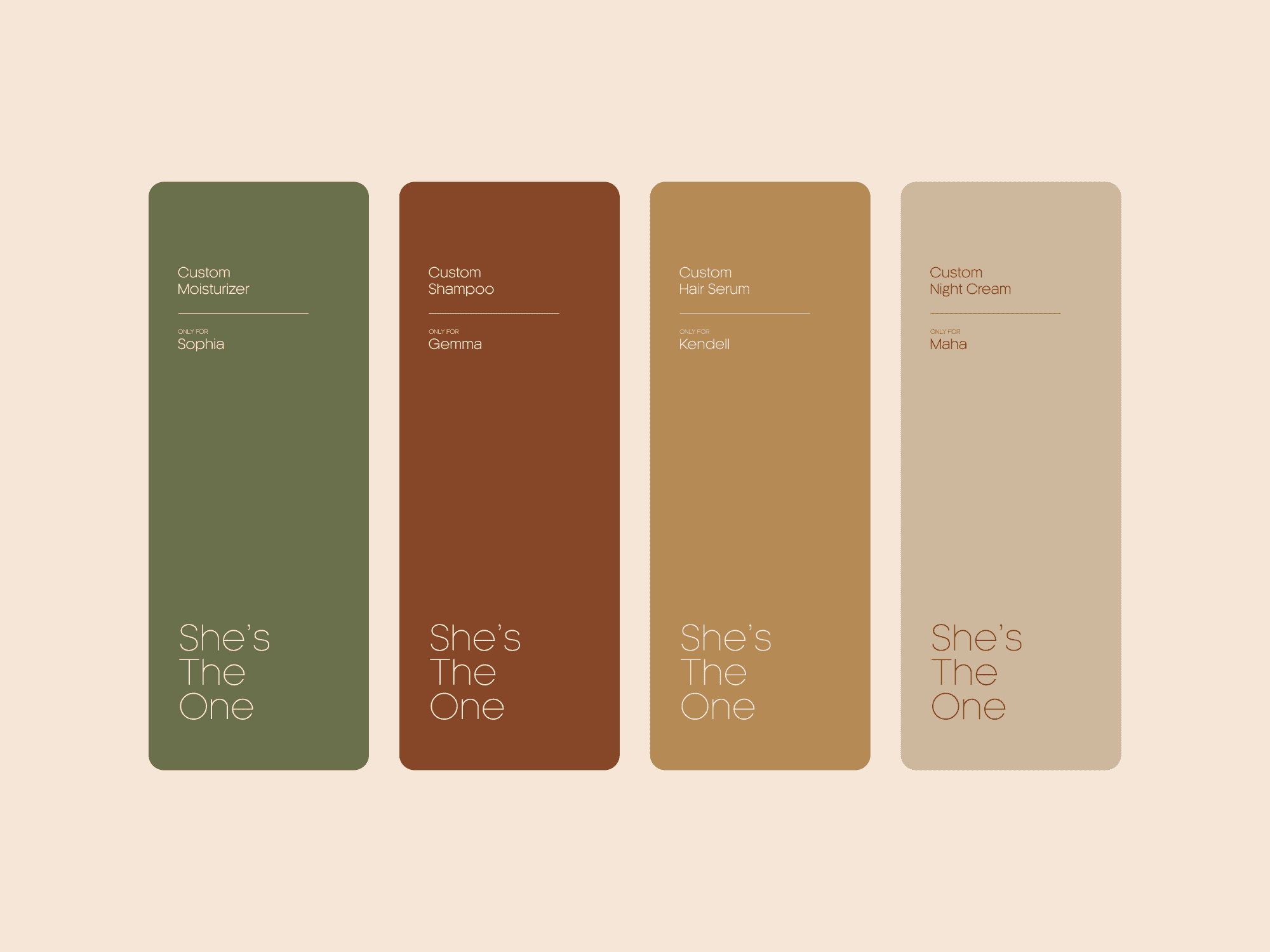
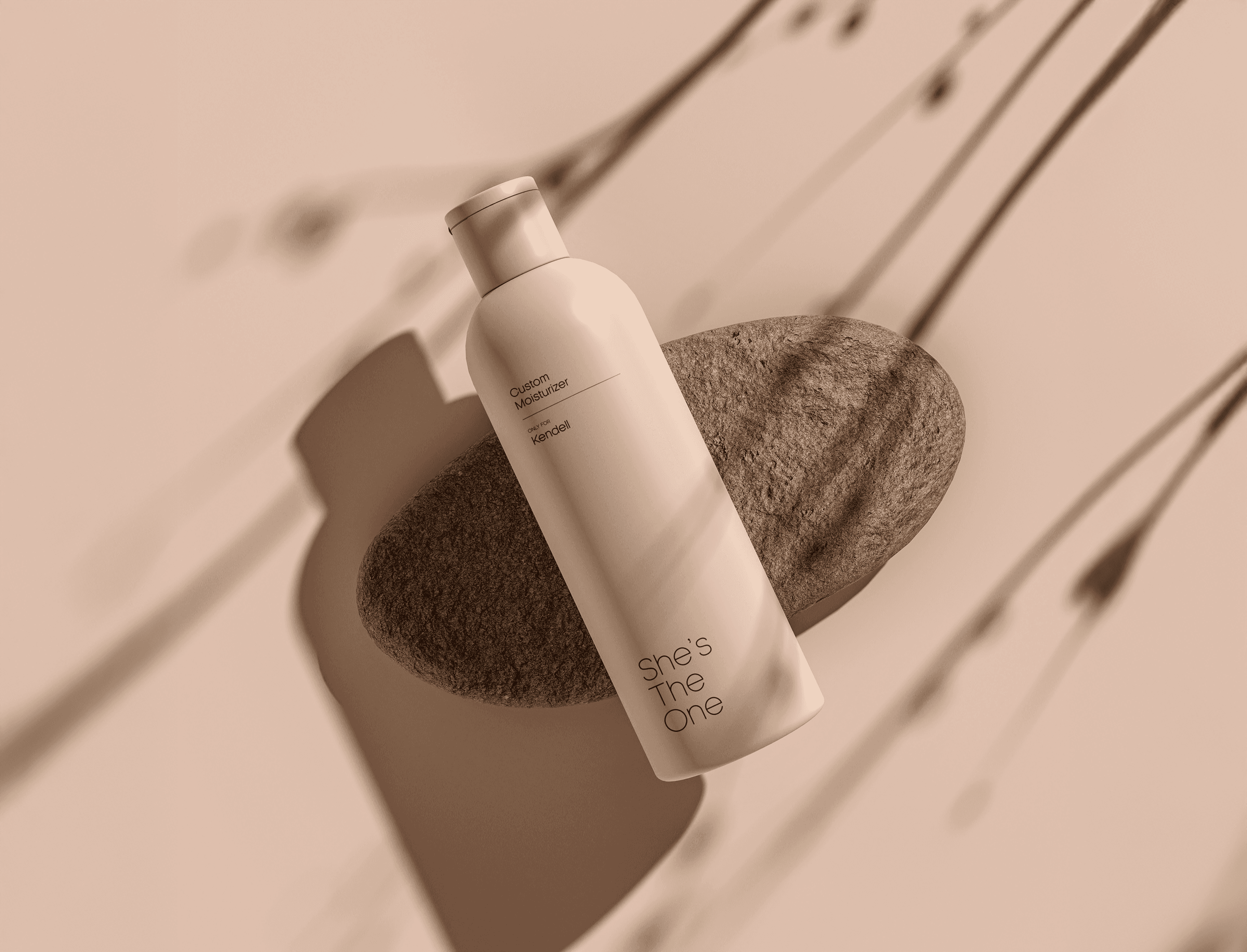
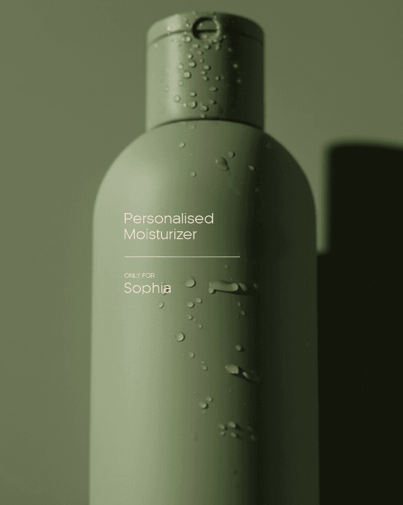
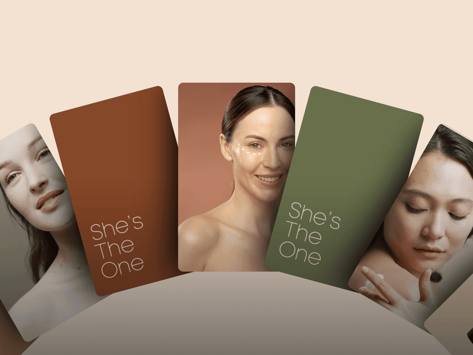
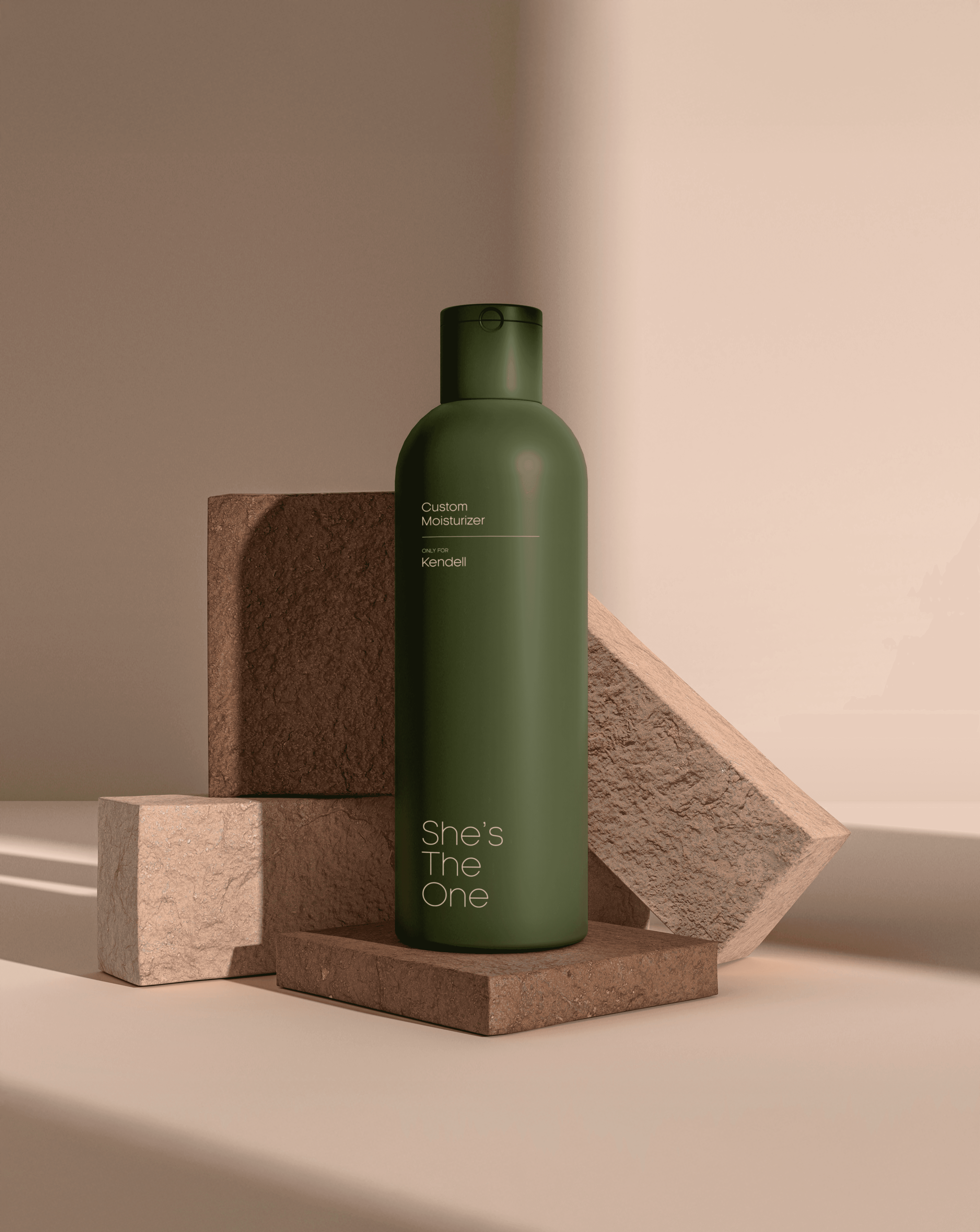
Most skincare brands try to speak to everyone. She's The One was built on the opposite premise: a deeply personalised system where the identity needed to feel as specific and considered as the product inside the bottle. Every formula is made to order, so the brand had to look like it: warm, intimate, and unmistakably made for one person rather than mass-produced for a shelf. The identity needed to hold six distinct tones without losing a single thread of recognition.
Most skincare brands try to speak to everyone. She's The One was built on the opposite premise.
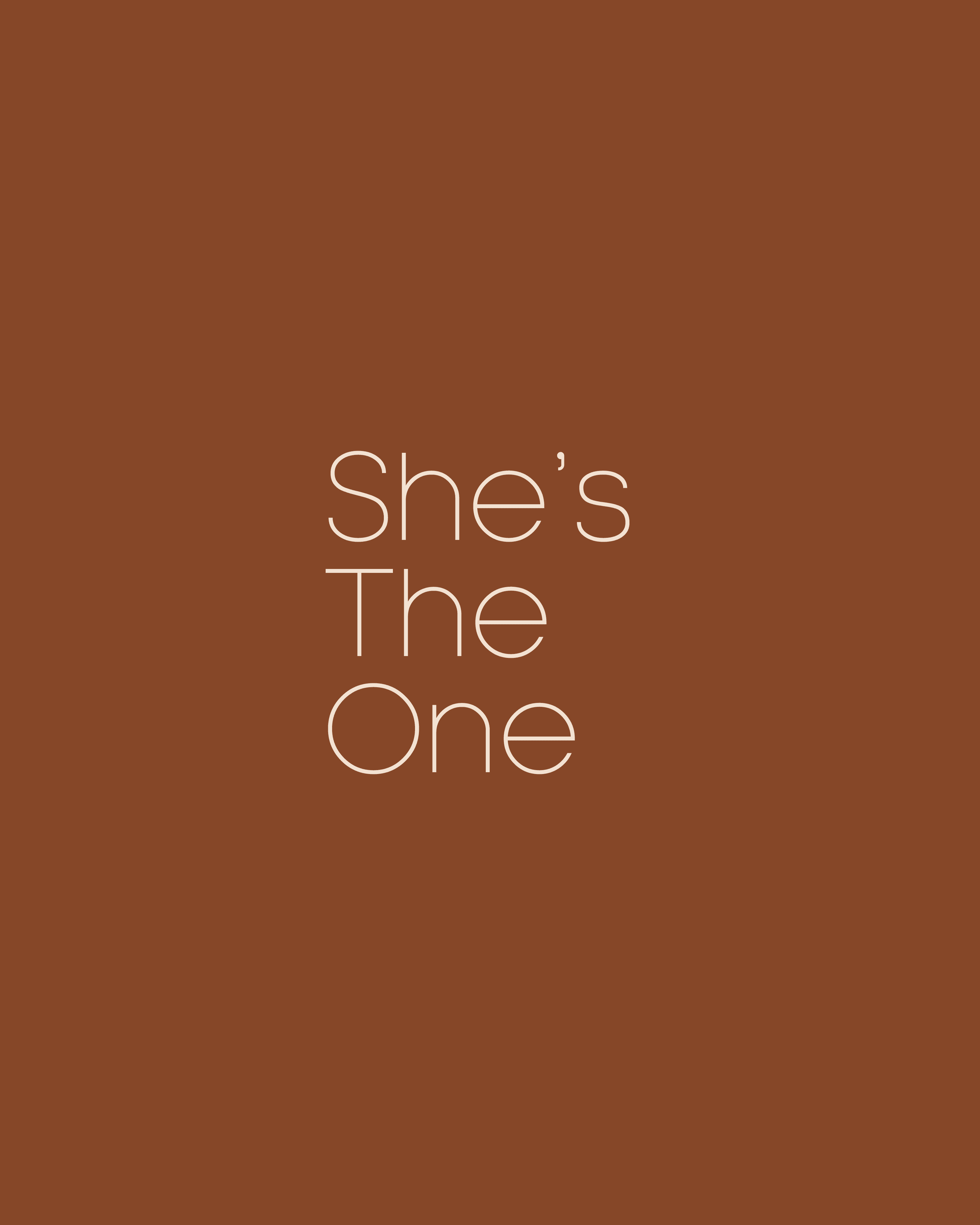
"We believe every woman deserves self-care as unique as she is. Born from the idea that she, you, is the one who matters most, the name reflects both the purpose and promise of the brand: to put her at the heart of every formula. Because She’s the One… and so are you. Our mission is simple: Self-care that starts with you."
In short, visual identity should be as unique and effective as the brand name. They are redefining Selfcare with made-to-order, personalized formulas, crafted uniquely for your skin, never mass-produced.
What the identity had to solve wasn't decoration, it was trust: proving in a single glance that a product this personal was worth trusting with your skin.