Services

Brand Identity, Packaging Design

Industry

Superfood CPG, Nutrition

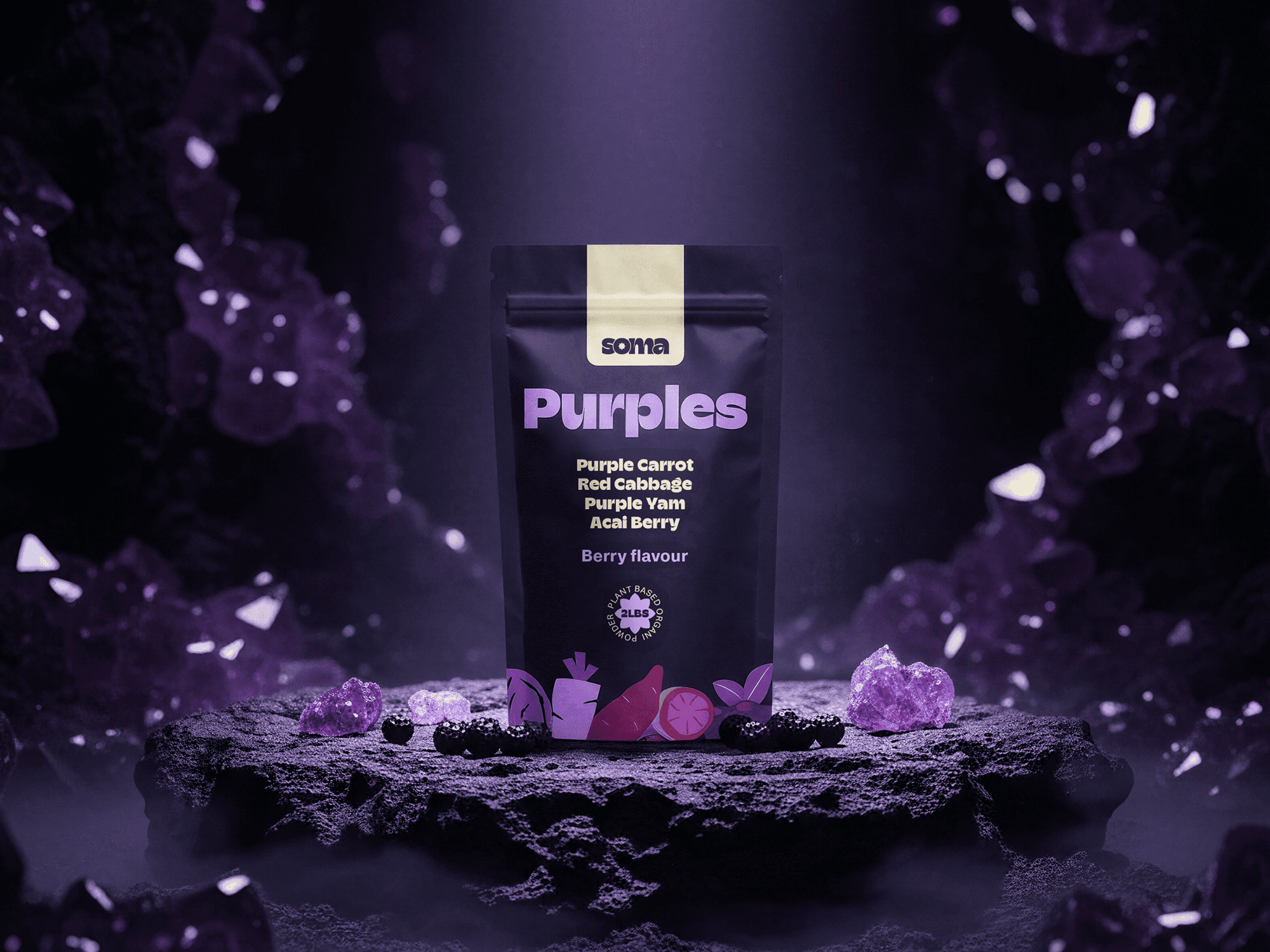
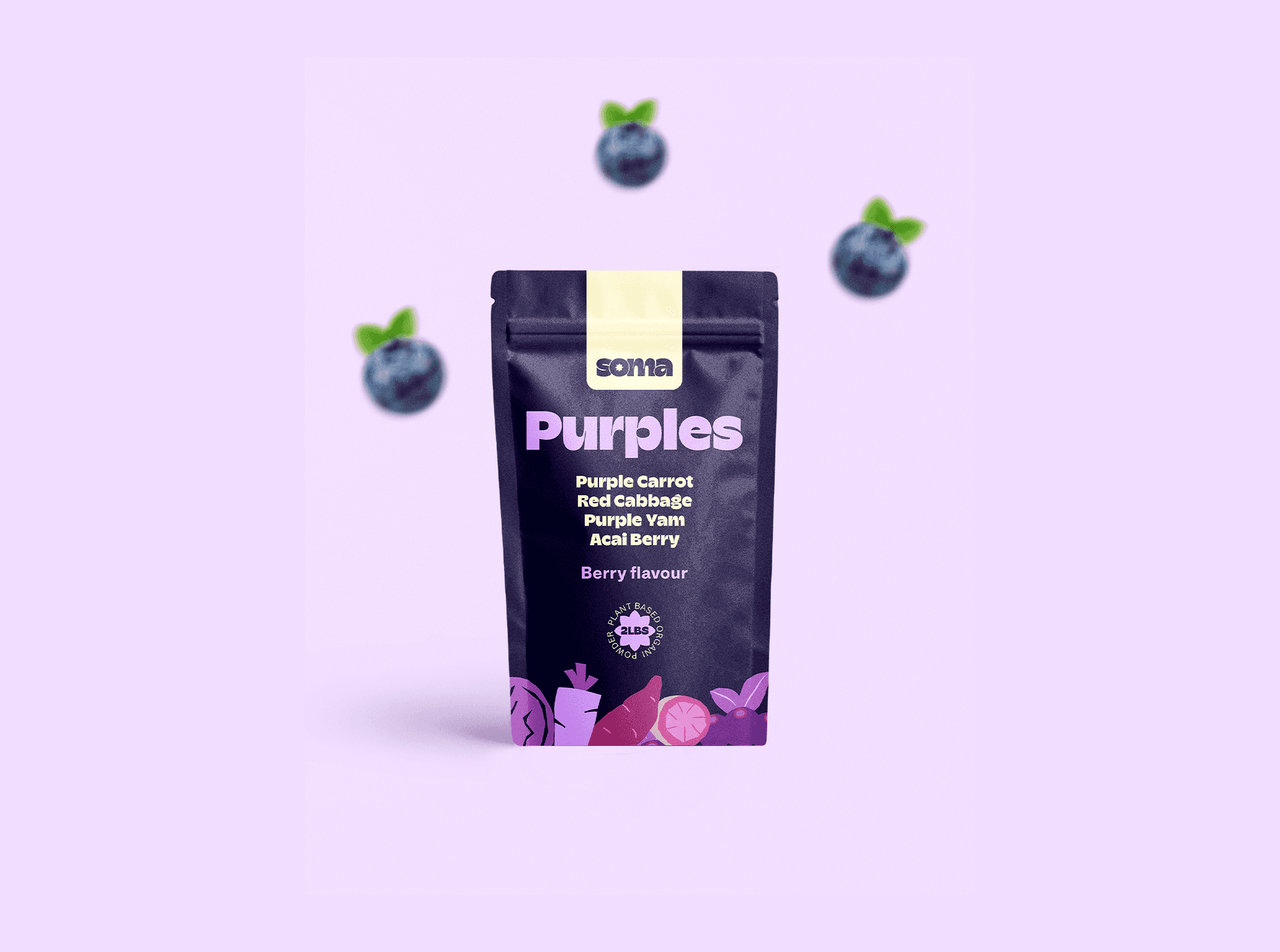
The ingredient is the identity.

A dark green matte stand-up pouch for "SOMA Greens" supplement, featuring lime green typography. The packaging is placed on a mossy rock in a moody, sun-drenched forest setting with ferns and organic light leaks.

The GCC produces only 44% of the vegetables it consumes. Most nutrition brands in the region respond to that gap with stock photography and vague wellness language.

The GCC produces only 44% of the vegetables it consumes. Only 7.5% of Saudi adults meet WHO vegetable intake recommendations. Most nutrition brands in the region respond to that gap with generic wellness language and stock photography of athletic bodies. SOMA made one design decision that changed everything: put the vegetable in the biggest type on the pack. Not the brand name. Not a benefit claim. The ingredient itself. Transparency as the visual argument.

A graphic displaying the bilingual logo design for the brand "SOMA" in a soft cream color against a dark green background. Above a thin horizontal divider is the brand name in Arabic/Urdu script, and below is the English version in a bold, retro-modern lowercase typeface. Both variations cleverly feature a matching geometric floral or star motif integrated into the negative space of the circular letters.
A dark matte stand-up pouch for "SOMA Purples" supplement, featuring lilac typography. The packaging rests on a rugged black stone in an atmospheric, misty cave setting, illuminated by glowing purple crystals and surrounded by scattered fresh blackberries.
A premium, cinematic product mockup for SOMA. The "Oranges" supplement pouch is featured on a moss-covered rock in the middle of a misty, sun-drenched autumn forest. The foreground is filled with dry leaves, while small pumpkins, orange peels, and carrot slices are staged around the product, highlighting the natural ingredients and organic aesthetic.
A professional brand identity animation for SOMA. The video features a smooth vertical wipe transition between primary and secondary brand colors, including earth-toned greens and neutrals, overlaid with a fine-grain linen texture for a premium, tactile feel.
A professional brand identity infographic for SOMA. The layout features a structured grid of the core color palette, including Forest Green, Sage, Cream, and Terracotta. Each color block is displayed with its corresponding HEX and RGB values against a subtle, linen-textured background, illustrating the brand's organic and premium visual system.
A top-down mockup featuring four SOMA supplement pouches arranged in a fan-like layout. Two pouches are in English ("Greens" and "Oranges") and two are in Arabic ("Arjuwani" and "Asfar"). Each pouch features a consistent cream-colored top label, bold rounded typography, and vibrant vegetable illustrations along the bottom edge.
A horizontal street-level billboard mockup for SOMA positioned against a modern red-brick building. The creative features the brand logo and the tagline "real vegetables. no excuses." in a thick, lime-green sans-serif font. A row of colorful, stylized vegetable icons lines the bottom of the dark green canvas.
A 4x4 grid of 16 stylized vegetable illustrations designed for the SOMA brand identity. The icons, including kale, ginger, pumpkin, and berries, are rendered in a flat, organic, "paper-cut" aesthetic using a vibrant palette of greens, purples, and earthy oranges set against tonal background squares.
A large-scale OOH billboard mockup for SOMA displayed on a structure of stacked shipping containers in an urban environment. The design features the SOMA brand name and the tagline "real vegetables. no excuses." in Arabic script, using lime-green typography over a deep forest-green background with illustrative vegetable accents.

The brief for Soma was deceptively simple:

Build a Daily Superfood Ritual brand for someone tired of wellness looking like a pharmacy or a gym. The insight that shaped everything came from a single frustration: the founder had every supplement brand hide its ingredients in fine print on the back. So Soma does the opposite—every ingredient, front and center, in the biggest letters on the pack. The bilingual identity treats Arabic and English as equals, not translations. Both scripts were built with the same weight, the same intention, the same hierarchy from the start. Four SKUs. Each one is honest about exactly what is inside in both directions.